FMX210 FINAL PORTFOLIO
ARTIST STATEMENT:
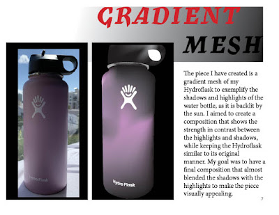
FMX210 has been a complex yet rewarding class over this past fall semester. This course has taught me the logistics of countless Adobe programs which have bettered my digital media skills. Attached is my portfolio which includes each final project from each program we worked with. My portfolio is themed as red and black with the font Mercurius MT std bold to better the overall composition. Each page is a different project and is done in chronological order from the first unit through the last. I aimed to use InDesign to successfully create a visually appealing portfolio while displaying each of my projects on the consecutive pages, along with a table of contents and an about me page.
My portfolio is crafted in such a way that is visually appealing through the use of color choices, creative fonts, and a simple approach to highlight each project. The theme I chose to create was based off of a few separate ideas I had, and is consistent and matches well, though it isn't to crowded to the point where my projects don't stand out. Each page includes one project with a description of my aim and overall idea when creating it. Secondly, each page also includes some form of red and black as well as my chosen base font to keep the theme consistent.
Overall, my InDesign portfolio is a great representation of what we learned, and what I took from this course as a whole. It is able to properly exemplify each project with a description of what the project is and how it's relevant. The theme works with the projects to create a visually appealing composition and tie the final portfolio together. FMX210 has been beneficial in teaching me what I need to know with regards to digital media and the large amount of Adobe programs. My projects are able to show my progress in what I have learned, and I aim to continue learning what I can to better myself in digital media.
Overall, my InDesign portfolio is a great representation of what we learned, and what I took from this course as a whole. It is able to properly exemplify each project with a description of what the project is and how it's relevant. The theme works with the projects to create a visually appealing composition and tie the final portfolio together. FMX210 has been beneficial in teaching me what I need to know with regards to digital media and the large amount of Adobe programs. My projects are able to show my progress in what I have learned, and I aim to continue learning what I can to better myself in digital media.


Comments
Post a Comment